Design Psychology: 10 Examples
June 26th, 2022

Psychology plays a big role in design. To a certain extent a product should behave how a user "expects" it to. Designers try to figure out how the user thinks and design something with that in mind. When a developer is designing an interface they have some sense for when something looks "right". When something looks/behaves how they want it to they move on. But wait... why was that the case?
There's an old poem called "The Centipede's Dilemma" about a centipede who struggled to explain how she walks. When she actually stopped to think about how she coordinated her dozens and dozens of legs it left her confused. Similarly, if you asked the average person why certain applications look and feel "right" they probably couldn't give you a detailed explanation. How does the brain comprehend design at the most fundamental level?
I recently read the book 100 Things Every Designer Needs to Know About People by psychologist Dr. Susan Weinschenk - it reveals some pretty interesting stuff about how people think. The book shines light on how the brain processes design and reacts to certain cues. I feel like it helped me get a better sense for why I was making some of my design decisions. I wanted to touch on ten ideas I found interesting.
People Identify Objects by Recognizing Patterns
The brain uses grouping and white space to create patterns. People look for them subconsciously. You can use this idea to make an interface more intuitive.
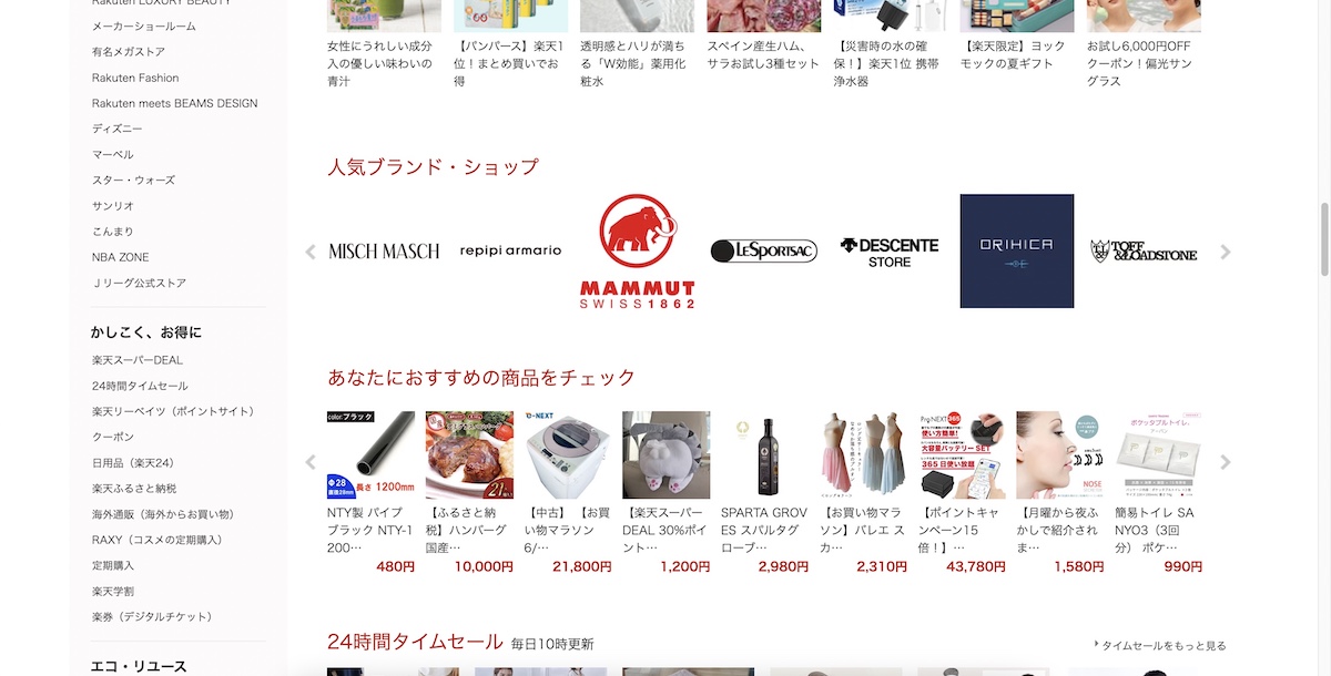
The following image shows the Japanese e-commerce site Rakuten. Even if you don't speak the language you should be able to recognize the structure here. Notice the use of white space and patterns - there are barely any borders or contrasting backgrounds but the sections are distinguishable.
People Scan Screens Based on Past Experience and Expectation
Consider how the user's vision will navigate a page. It's usually safe to structure things so vision follows a normal reading pattern. If you'd never used the internet before and someone showed you a Wikipedia page you'd probably have a sense for how to navigate it. It reads like a book would. We've been conditioned to consume text a certain way. Wikipedia leverages this to communicate an impressive amount of information. The same idea applies to a blog post like this one.
Side note: when designing a web page, try to avoid structure where vision has to jump back and forth to accomplish a task - don't put important content along the outer edges.
Reading and Comprehending are Two Different Things
Don't assume people will remember specific information an application provides. What they understand and remember usually depends on things like point of view, prior instruction, and previous experience.
I remember the first time I read a book. Well the first one that wasn't children's picture book. It was maybe fifty pages of large text. Anyway, I was very excited to tell my parents. When I went downstairs and told my Mom she asked me to explain what the book was about. It was at that moment I realized something important. When you read something you actually have to comprehend, internalize, and ideally learn something from what you read. Less than a minute after putting it down I had completely forgotten what it was about.
As a designer you want to leverage your skills to help the user internalize important information as easily as possible. If we're just talking about text - you can use things like bold and/or italic fonts, highlighting, supplemental images, etc. News websites do a good job of this. Notice the use of images and bold text in the following BBC article:

People Remember Only Four Items at Once
Think in fours. Four sections, four sentences, four list items, etc. This isn't always possible but it's useful to keep in mind.
The following image shows the Amazon landing page. Notice how there are four white boxes, two of which show four image links. The design team at Amazon is utilizing the number four here. If the user closes the page straight away without clicking anything they're more likely to remember what they saw.

People Have to Use Information to Make it Stick
Practice makes perfect. If you want the user to remember something, repeat it where you can. Additionally, if you have a sense for who your users are try to repeat things in a way that caters to how they think.
People Process Information Better in Bite-Sized Chunks
Try to identify the most relevant information you want to convey and structure things around that. You'll want to avoid lumping in extra information if possible. In the context of web development, you might want to put extra information on a separate page and provide a link - rather than having everything in one place. Dr. Weinschenk points out how extra clicking is better than extra thinking.
Tabs are another way to break down a large amount of information into smaller pieces. You'll see tabs often on the web. Here are some used by NewEgg (a computer parts retailer) on their product pages:

People Learn Best From Examples
If you want the user to do something (e.g. make a purchase on an e-commerce site) you might want to consider showing them how to do it. The simplest way to do this is to include images like I'm doing here. 😁
A particularly good example of this is Flexbox Froggy, a game meant to help web developers learn the CSS tool flexbox. Learning something tricky is a lot easier when you have interactive examples. Even better if you can make things fun!

People are More Motivated as They Get Closer to a Goal
If you want the user to do something, consider showing them a visual representation of progress. So let's say you want the user to sign up for a service... as the user goes through steps, show them the steps and indicate which one they're on. Check out the following image from the New York Times signup page. Notice how the three main parts of the signup flow are shown at the top along with a progress bar. This is a subtle way of influencing the user.

Anecdotes Persuade More Than Data
You can help the user internalize something by giving it some sort of emotional hook. Everyone is empathetic to a certain extent, we have an easier time internalizing stories than we do statistics. Try to communicate information with a story when you can - if not a story maybe a quote or an analogy.
Perhaps the best example of this is the user testimonial. Gaining the user's trust is invaluable. Providing examples of prior satisfied users helps a ton. Here's a good example of a testimonial section on law firm's website:

People Make Most Decisions Unconsciously
More often then not the reason someone will give you for doing something will differ from their unconscious motivation. Some common motivating factors might include the decisions others made, what they identify with, what choice solves some other problem, whether the choice is impermanent, etc. If you have enough data to determine how your average user thinks at a fundamental level, speak to their most basic motivations.
When People Are Uncertain, They Let Others Decide What To Do
If you give the user the ability to choose what to do, make the option you want them to choose the most appealing. An e-commerce site will often display the most favorable reviews of a product first. This way if a customer is on the fence about buying there's a better chance they'll do so.
Here's the first few reviews for a guitar on the musical instrument retailer Sweetwater's site:

The book is chock full of cool ideas. While they all relate to design, some of them had me thinking about human nature and life in general. 🤔 For example:
- The meanings of colors vary by culture.
- People reconstruct memories each time they remember them.
- The most vivid memories are wrong.
- People are driven to create categories.
- Culture affects how people think.
- People are inherently lazy.
- The "strong tie" group size limit is 150 people.
- People are hard-wired for imitation and empathy.
- People are happier when they're busy.
- The more difficult something is to achieve, the more people like it.
In the context of UI/UX - good designers are considered good not because they stop and think of these kinds of ideas when they're building something, but because they've spent countless hours creating things and critiquing the work of others. The brain has a wonderful way of taking information/experience and turning it into skill. With that said, it's useful to consider these ideas from time to time - especially when you're asked to leverage design to motivate a user to do something.